Properties grid: Uniforming the user interface
In Omega 365 the new "Properties Grid" component is implemented in several of our apps, providing an easier way of getting an overview of all the properties and meta data.
In the Documents Register, each document profile can include dozens of properties or metadata. With the updated properties grid, the layout is as follows:
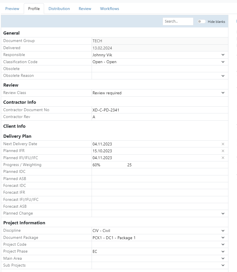
The users can use the search function to search of a property (e.g. discipline), and one can choose to hide those that does not have any value ("hide blanks"). The properties are also grouped together for better usability.
Note that it is also possible to exclude properties completely per document type.
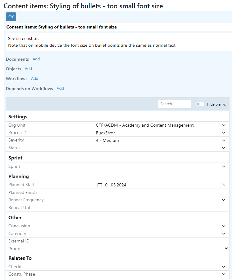
Also in workflows you will find the same "Properties grid", in the "Workflow Basis" section:
Another benefit with the Properties grid is how well it works on different screen sizes, including mobile devices. Within the register apps, users can conveniently access detailed views alongside the grid, which is designed to complement and enhance grid usage efficiently.
The Properties Grid also supports including the new custom-defined fields concept with "Properties" that can be defined per customer. There is basically no difference in the user interface between a user defined field, and a standard product field, both in the register app and in the detail app. Read more about "Properties" in this blog: Using properties to meet customers unique requirements